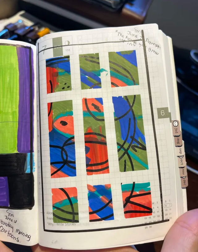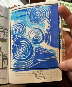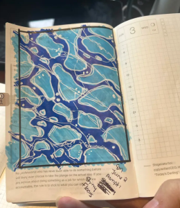
I really like how this miniature acrylic pour turned out.

I really like how this miniature acrylic pour turned out.

I’ve seen people do some really neat things with acrylic pours, so I decided to try my own version using miniature canvas. I mixed acrylic paint with modge podge, and then added a few drops of machine oil (that’s what makes the bubbles you see). Then layered a few colours of paints together, and poured it over the canvas. It didn’t quite get the effect I was going for, but it was fun and interesting to experiment, and I really like the final product!
I haven’t decided what I’ll do with them yet, I have a few of these miniatures, but I might put them all in one larger frame together. We’ll see.

Crochet is not my favourite thing to do, but I try to keep practicing it and when your kiddo asks for an axolotl, of course you oblige. Even though I can see all of the wonky that this little creature has, my kid absolutely loved it, and honestly that’s all that matters.

I happen to be a left handed person. My whole life, people would try to get me to use my right hand – sometimes successfully. For example when I was in school there were no such things as left handed scissors, so I use those with the ‘wrong’ hand now. My computer mouse is another one. When I would sweep the floor, my Mom used to say I was ‘doing it wrong’ because of how I held the broom. So of course I learned to adapt with these small tasks, to do them the ‘right’ way.
I’ve always wanted to learn to write with my right hand because let’s face it, fountain pens and left handed people do NOT go hand in hand. We smear our work, we push the pen instead of pull, and it’s just not a pleasant experience despite the fact that I almost always use a fountain pen. So. I decided why not teach myself.
I bought a blank notebook, and started writing out The Count of Monte Cristo. I thought I’d see where I’m at in a year, and if I could ‘write’ any better with my right hand. Weird task? Maybe! But it gets me using my fountain pens and let’s face it I’m always up for that.

This year I wanted to flesh out my reference book collection a little bit when it comes to art. I have a few books, but I’d like to get a few more on anatomy, and colour theory. I’ve never really been able to draw people, sticking to mostly organic shapes and landscapes, but it’s something that has always been on my ‘wish list’ so to speak. So I’ve been doing a bit of research, and plan on doing a bit of shopping (eventually).
One ‘must have’ I grabbed, is the book pictured above – A Dictionary of Color Combinations. This book is lovely, and is just filled with page after page of color combinations. Nothing fancy, nothing complicated. If I’m stuck, I can just flip open to a page and find something that appeals to me.
Have any recommendations for art theory reference books? Be sure to drop me a comment and let me know!

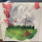
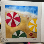
This painting is the result of a YouTube tutorial that I found, and I think it turned out pretty cute. I’m still trying to learn how to use my watercolours properly, and sometimes I don’t really have any creative ideas but I do still want to be creative. Following along with tutorials can scratch that itch, and teach me some neat techniques.

I asked around a few friends who do watercolour painting for paint brand suggestions. I’ve been using Winsor & Newton (pictured on the right) but they are student grade paints, and are not lightfast. Not a HUGE issue as I’m not selling any originals, but I wanted to try out some professional grade paints.
One of my mutuals suggested I try ‘White Nights’ which I had never heard of. They’re a brand from Russia, and quite a bit cheaper than Danielle Smith, which is who I was going to go with.
My set arrived yesterday, and I spent some time swatching and getting to know the colours. Beautiful pigments, they behaved how I would expect for watercolour. Once I got the swatching all done I decided to do an art tutorial project with them, which I will post tomorrow. Overall, I was really impressed with these paints. I haven’t started mixing much with them yet, but that will come next. I wanted to keep the pallet minimal so that I can continue to work colour theory and learn how to mix colours myself. I’ll get there!

I love fountain pens. For a few years now I’ve started collecting a handful of cheaper pens to experiment with and figure out what sort of nib I enjoyed. I’ve got a few EF (extra fine), some M (medium) and some F (fine). I learned there’s a difference between EF in the East, and EF in the West, depending on manufacturers. I don’t own a broad nib yet, but that is on my list. None of my pens are particularly expensive, minus the one that I inherited from my MIL when she passed. From front left to right is:
Lamy Safari, Parker 21 (birthday gift from my husband), HongDion Forest series, Sailor Fude, two Kakuno, a Wing Sung 3008 (I bought this from Temu for $5, and it’s my favourite pen), and a TWSBI Eco-T. Up top is the Pelikan Jazz, and my St. Dupont Laque de Chine.
I used the Safari for many years before ever venturing further into this hobby (and yes, it is a hobby) and used the same purple ink for all of those years. The pen was gifted to me for Christmas by my cousin. It basically cemented my love for fountain pens, and it wasn’t until 10 years later that I started experimenting a little bit. I suppose most of that comes from finally having ‘grown up money’ to spend on things. For many (many) years I simply didn’t / couldn’t.
I love writing with these pens, and I love drawing with these pens. There’s just something very tactical about them – and I absolutely love playing with the ink that goes along with them, too. I’ve got a few bottles now and some absolute favourites. Especially ink that has shine or sheen. Any way. Fountain pens do NOT have to be expensive. I mentioned above that my favourite pen actually came from Temu and was $5. It has a HUGE ink reservoir and writes beautifully. I think I’ve also gotten quite lucky with my pens, most of them are just lovely. The most expensive would be the St. Dupont, followed by the Parker 21 (they’re both vintage pens), and then the TWSBI ECO-T and that one was around $50. The rest of the collection are all $5-$20. I do still want to add a broad nib or a flex tip to the collection sometime, but for now I have more than enough.

One of my favourite notebooks (pictured above) that I own is bound in leather with cotton pages and I have such an urge to try painting on them. I haven’t yet, though I have tried drawing on them. I’m hoping when my new ‘White Nights’ watercolour paint shows up this week, I’ll get brave enough to give it a shot.
The pages are made to look aged on purpose, and it is such a tactile way of writing on them. At first I didn’t know what I could possibly write that would be ‘worthy’ of such a book – but in the end I realized none of that matters, what matters is USING the book. So use it I shall.

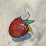
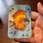
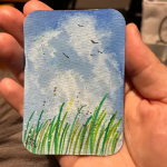
Another artist trading card – and this one was done in watercolour paint, with a little bit of gouache (white) over top. I was playing around with my watercolours just experimenting with it, and love how it turned out. Originally I had left the background as white, but it didn’t feel completed. So I added the background, and vola. Love.